Jayne Gowan
Account Director
Case Study
Forterra
Case Study
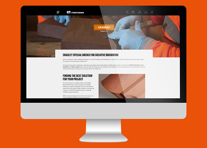
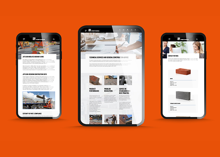
A fresh, modern and engaging new website for Forterra
Find out more about…
Forterra is a leading manufacturer of clay and concrete building products, used extensively within the construction sector, employing over 1,800 people across 18 facilities in the UK. Forterra’s brands enjoy a long pedigree and have developed a broad customer base. They manufacture a wide range of trusted products that form an essential and substantial part of the built environment. They are one of the largest brick and aircrete block manufacturers in the country and the only producer of the iconic London Brick. Other trusted brands from Forterra include Thermalite, Conbloc, Ecostock, Butterley, Cradley, Red Bank Bison Precast and Formpave.
As part of a broader rebranding initiative, Forterra sought to transform its website – an imperative part of its customer journey. Their original online platform was no longer capable of catering for Forterra’s extensive, diverse audience and growing product portfolio.
To deliver a modern customer experience that stands out among the more traditional approaches of their competitors, Forterra wanted a fresh and contemporary solution that “drives traffic, engages prospects, generates leads and re-engages customers” while bringing to life the new brand identity that Forterra was developing.
They also needed a flexible content management system (CMS) that could be used by their marketing team to update website content quickly and easily, to raise awareness of new products and innovations in a timely manner.
Forterra put this project to tender; and selected PDS from a group of four candidate agencies as their website design, development and SEO partner. We were chosen due to our expert SEO strategy, engaging design proposals, and reputation as a safe pair of hands that deliver on our commitments.


A strong SEO strategy:
PDS conducted all of the initial SEO research and planning, which informed our approach to UX design and website development. We also consulted with the team who were creating the content for the website – providing guidance on keyword usage, readability and other elements of SEO copywriting. All this has ensured that Forterra’s website has been designed and built on solid SEO foundations, which continue to support a best-practice SEO strategy in the future.
A customer-centric UX:
One of Forterra’s key objectives was to create a more intuitive UX that caters for all segments of its customer base without alienating anyone or causing friction. By mapping out and understanding user journeys for some of Forterra’s key audience segments, we could remove some unnecessary layers of content, streamline the entire user experience, and communicate Forterra’s value propositions much faster. Now, all users can quickly understand that Forterra offers a product or service that is relevant to them.
An innovative approach to design:
During the design phase, we used technology that allowed the Forterra team to review low-fidelity prototypes instead of one-dimensional PDF proofs as part of concept development. This approach made it easier for our client to understand how all the dynamic and animated elements would work when the site was finalised. This, in turn, accelerated time to value.
Promoting the new website:
To promote the new website post-launch, PDS assisted with a social media campaign and redesigning Forterra’s flagship Brick Guide, one of the company’s most downloaded collateral pieces. Ongoing monitoring and refinements: Forterra has also entrusted PDS to manage the ongoing support and maintenance of their website. This includes hosting the site and carrying out updates as needed. PDS is also monitoring, reviewing and improving SEO activities as we learn more about how various different types of customers use the website.
Jayne Gowan (Account Director), David Nelson (Lead Creative)

Account Director

Lead Creative
Interested in how PDS can help you deliver solutions across our service pillars?
Forterra’s new website leads users on a logical, friction-free journey – giving them quick links to the elements that they utilise the most. It also provides a more streamlined product offering, which enables users to quickly understand which solutions they need and find relevant products with ease.
By inserting call-to-action messages throughout the website, at the correct points in the user journey, we have seen a considerable improvement in generating leads and enquiries. In the first month alone, for example, the number of website form enquiries shot up from around 80 to over 700.
Another element that helps to increase engagement is the new website look and feel. The design uses compelling videos and simple animations to create a fresh customer experience that stands out from the other offerings on the market.
Forterra also now have an accessible and user-friendly CMS, which can be used to swiftly update content, add products and refresh various marketing elements, so the website is always up to date and on point.
“We’re delighted with the new website which has provided us with a clean, contemporary and dynamic showcase for our diverse product range. We have delivered a much more intuitive experience for our customers, ensuring that they can easily access the information they are looking for while also discovering more about how our expertise in the sector can assist with their construction projects.”
Looking for a user-friendly and visually stunning website that enhances your visitor’s journey? Our experienced team of agencypds designers and Codeheroes developers can assist you with everything from UX design to call-to-action optimisation. Plus, with user-friendly CMS, if you wish to, you’ll be able to easily manage your website’s content and updates.
Arrange a call to get started!