
David Nelson
Lead Creative
Case Study
Booker
Case Study
Alfred Button Spirits
Find out more about…
Founded by George and Richard Booker in 1835, the Booker Group is the UK’s leading food & drink wholesale operator – and a subsidiary of Tesco. Committed to improving choice, price and service for customers, the Booker Group offers an extensive range of own-label and branded goods across the on-trade and off-trade environment.
When the Booker Group wanted to launch a new range of premium own-label spirits as part of their Alfred Button portfolio, their challenge was to capture customers’ attention in a space filled with new and established spirit brands. These spirits were being launched in the on-trade environment, including pubs, bars, clubs and restaurants. As one of Booker Group’s creative services partner on this project, our key challenge was to develop unique brand identities for a diverse collection of spirits – including a variety of gins, vodkas and rums – that were also unified
as a premium Alfred Button range. Our client wanted each product to have its own distinctive character and style, yet still be recognisable as part of the new range. Overall, the Booker Group wanted a premium look and feel, so that every spirit within this range could sit well on shelf alongside other high-end brands. Within each label design, we were asked to include the distinct Alfred Button branding, without overpowering the identity of each product. Our client wanted the character of the spirit and its unique flavour profile to remain the focus of attention.
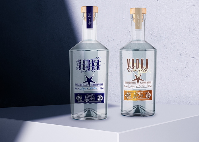
The client opted for one bottle shape to tie all the different products together: a clear glass ‘Titus’ bottle with a cork. Our lead creative then presented creative concepts for the label designs – offering five versions to choose from. These design concepts showcased how the range would tie together visually and conceptually, and how each product would have its own identity within that range.
We approached this project in two phases. The first phase focused on London Gin, Blue Vodka and Vanilla Vodka. The second phase will include various flavours of Gin, Rum and Vodka.
The branding challenges were resolved by creating a secondary label sitting at the bottom of the bottle dedicated only to the Alfred Button brand name.
Using a stamp-style label enabled us to vary the colour palette across the different drinks, yet retain a cohesive range identity. The Alfred Button brand is also subtly featured on each label as a signature and again on the tea strip seal across the bottle top.
The design of each spirit label provided the overall distinction. For the gins, we chose a paper label and featured illustrations of the botanicals used within the flavour.
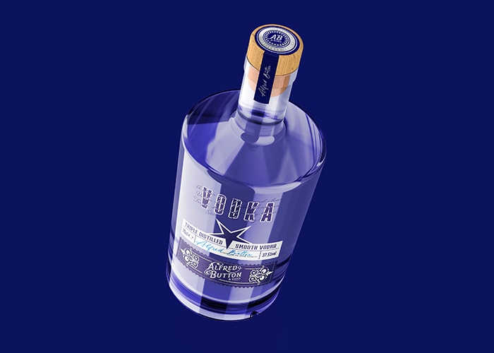
The vodkas were designed with clear labels – a specific request from the client. The greatest challenge was developing a design for the Blue Vodka, which is not flavoured like the others in the range and therefore has fewer visual references to call upon. Our designers resolved this by opting for a typography-based approach and the inclusion of star gave the vodkas a muted Russian feel.
Finally, with the rums, we chose a paper label and used rich, colourful images of tropical fruits with a nod to tribal carvings to reinforce a tropical island atmosphere.
David Nelson (Lead Creative)
Lead Creative
Interested in how PDS can help you deliver solutions across our service pillars?
Each product within the range successfully reflects the unique character of that particular spirit and holds its own regarding shelf-presence alongside other premium brands.
The branding and artwork was universally well-received and approved with minor adjustments. The interpretation of the brief and turnaround allowed our client to launch the product range in good time to meet Christmas 2021 sales.
Looking to elevate your brand, build a stronger identity, and make better creative connections? Our team of agencypds creatives will work with you to bring your vision to life and create branding that has a lasting impact.